2019 ANUGA Exposure Report
|
 ̄
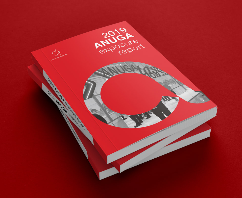
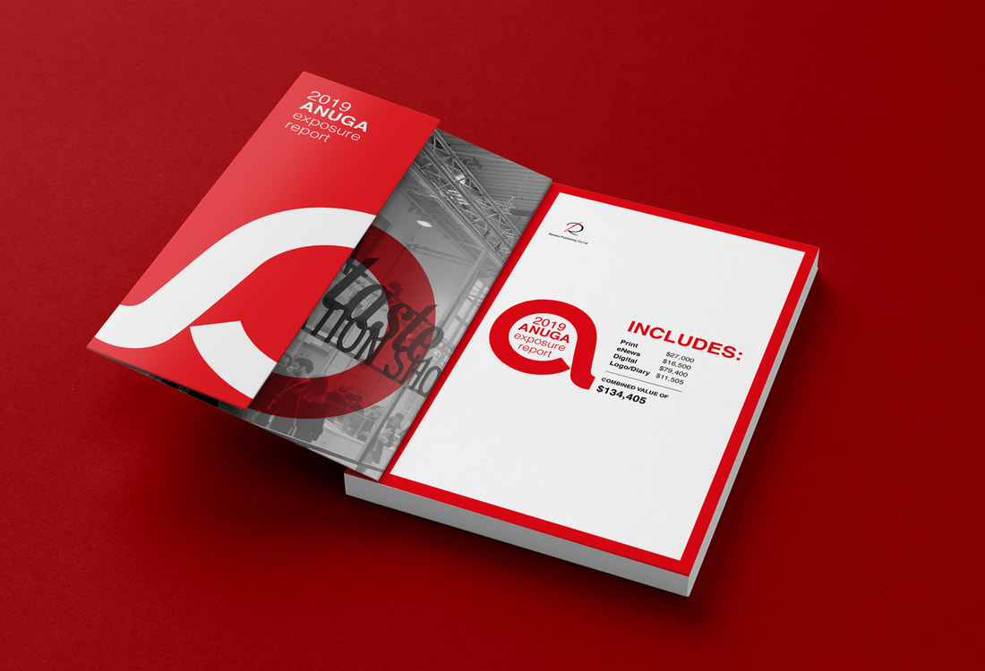
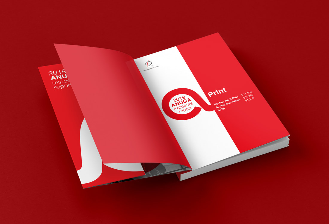
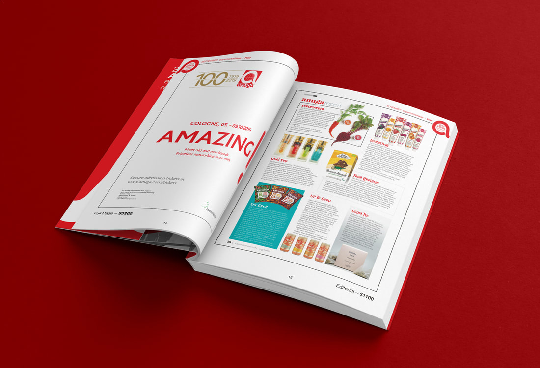
This is a design for an annual report to ANUGA who is one of Review Publishing's clients. As the audience of this design is ANUGA, I generated a visual system, including an 'a' shape and red colour, from the logo of ANUGA, and applied this system to each page design, in order to represent the image of ANUGA in the entire handbook. A mixed logo combined the shape of 'a' and the title of this book '2019 ANUGA exposure report' is the key sign of the visual system that runs through the whole book. Based on this basic rule, I developed a simple and clean style so that the body of this book - various pictures referring to exposures for ANUGA - would not result in a busy reading experience. All in all, I attempted to make use of design to strengthen what Review Publishing had done for ANUGA's exposure in a variety of media, and tried to develop a visual identity system for Review Publishing's design work. CREATIVE FIELDS: Print design
TOOLS: Illustrator, InDesign, Photoshop YEAR: 2019 |
|
Concept
▼
Outcome
▼